
How Colors Affect Art Photography
Colors have a powerful influence on how we perceive the world, and in art photography, they can completely change the mood, story, and impact of an image. Understanding color in photography isn’t just about picking pretty shades—it’s about evoking emotion, guiding the viewer’s eye, and creating harmony in every frame. Whether you’re a beginner, a…
Colors have a powerful influence on how we perceive the world, and in art photography, they can completely change the mood, story, and impact of an image. Understanding color in photography isn’t just about picking pretty shades—it’s about evoking emotion, guiding the viewer’s eye, and creating harmony in every frame. Whether you’re a beginner, a homeowner decorating your space with photo art, or simply someone who loves visual storytelling, learning how colors affect art photography can transform ordinary shots into captivating masterpieces. Let’s explore the subtle yet transformative role of color in photography.
Why Colors Matter in Art Photography
Color is one of the first things people notice in a photograph. It can communicate feelings instantly—warm colors like red and orange evoke energy and passion, while cool colors like blue and green suggest calm and serenity. Artists and photographers use color to:
-
Set a mood or emotional tone
-
Highlight a subject or focal point
-
Create depth and contrast
-
Tell a story without words
Even in minimalist photography, a single pop of color can make an image unforgettable. Ignoring color can make your photos feel flat, no matter how perfect the composition is.
Understanding Color Psychology
Color psychology is the study of how hues influence emotions and behavior. When applied to photography, it allows you to deliberately shape how viewers feel. Here’s a simple breakdown:
-
Red: Energy, passion, attention—great for vibrant street photography or dramatic portraits.
-
Orange: Warmth, creativity, friendliness—works well in lifestyle and urban photography.
-
Yellow: Happiness, optimism, playfulness—ideal for family or nature photos.
-
Green: Peace, growth, freshness—perfect for landscapes and eco-inspired shots.
-
Blue: Calm, trust, introspection—useful in portraits or serene urban views.
-
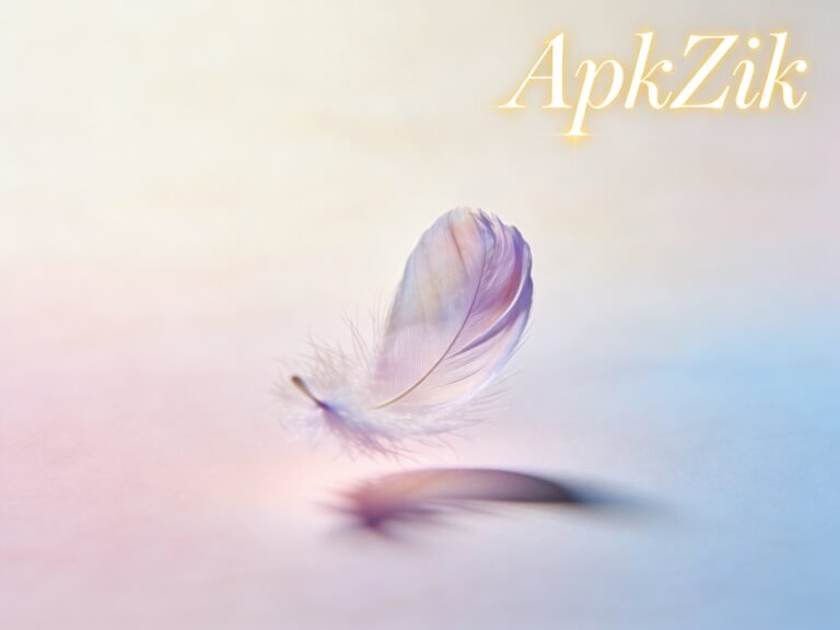
Purple: Mystery, luxury, creativity—adds a sophisticated touch.
-
Neutrals (white, gray, black, beige): Balance, simplicity, timelessness—perfect for framing colorful accents.
Tip: Combining colors thoughtfully—like complementary colors (blue & orange) or analogous shades (green & yellow)—creates harmony and visual interest.
How to Use Colors Effectively in Your Photography
1. Plan Your Color Palette
Before taking a photo, think about the mood you want to convey.
-
Warm palette: Reds, oranges, yellows – energetic and inviting.
-
Cool palette: Blues, greens, purples – calming and contemplative.
-
Monochrome: Variations of one color – minimalistic, elegant.
Planning ahead saves time in post-processing and keeps your photos consistent.
2. Play with Contrasts
Contrast draws attention to your subject. Use color contrast to make elements pop:
-
Bright subject on a muted background
-
Opposite colors on the color wheel
-
Light tones against dark shadows
Example: A bright yellow umbrella in a rainy cityscape instantly becomes the focal point.
3. Consider the Lighting
Lighting affects color perception dramatically. Golden hour sunlight enriches warm tones, while overcast skies enhance cooler shades. Understanding how light changes colors helps you capture the intended mood naturally.
4. Experiment with Backgrounds
Even a simple backdrop can change a photo’s entire feel.
-
Neutral walls or fabrics can emphasize the subject.
-
Textured or colorful backgrounds add depth and context.
-
Urban settings with graffiti or street art provide bold, playful palettes.
5. Avoid Common Mistakes
Many beginners overlook these pitfalls:
-
Too many conflicting colors: Creates chaos and distraction.
-
Ignoring color harmony: Clashing tones can confuse viewers.
-
Over-editing colors: Saturation overkill makes images look artificial.
A careful, subtle approach keeps your photography natural and engaging.
Real-Life Examples and Practical Tips
-
Nature Photography: Capture contrasting hues like autumn leaves against a calm lake. It tells a story without words.
-
Urban Photography: Use neon signs or colorful street murals to guide the eye.
-
Portrait Photography: Clothing, props, and backgrounds can either complement or clash with the subject—plan for harmony.
-
Lifestyle Shots: When photographing homes or interiors, coordinate furniture, walls, and accessories to create a coherent palette.
Budget-friendly tip: You don’t need expensive props—everyday items like colored fabrics, flowers, or painted walls can transform a photo.
Modern Trends in Color Photography
-
Muted Tones: Soft pastels and desaturated colors create a timeless and elegant aesthetic.
-
Bold Color Pops: Minimalist backgrounds with one striking color accent continue to dominate social media feeds.
-
Monochromatic Themes: Focusing on one color family adds cohesion and sophistication.
-
Natural Color Stories: Authentic colors in raw environments make images relatable and immersive.
The key is balancing trendiness with timeless principles—avoid following trends blindly.
Conclusion: Harnessing the Power of Color
Colors are more than decoration in photography—they’re emotional cues, storytelling tools, and compositional guides. By understanding color psychology, planning your palette, and experimenting thoughtfully with contrasts, lighting, and backgrounds, you can create art photography that resonates deeply with viewers.
Remember: subtlety often beats saturation, and harmony outweighs randomness. Start small, observe how colors affect your emotions and the viewer’s attention, and soon, you’ll see your photos transform from ordinary snapshots into compelling visual stories.
FAQ
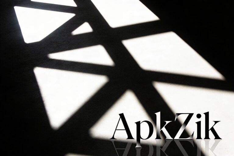
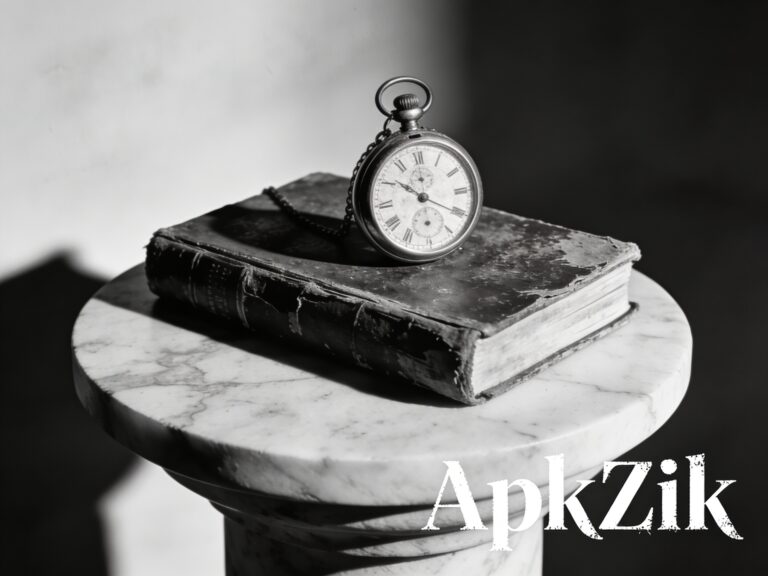
Q1: Can I use black-and-white photography effectively?
Yes! Black-and-white photography emphasizes contrast, shape, and texture. It’s timeless and works well when color might distract from the subject.
Q2: How do I pick the best colors for a portrait?
Consider the subject’s skin tone, clothing, and background. Complementary or harmonious colors enhance the overall aesthetic naturally.
Q3: Is post-processing necessary for color control?
Basic edits like adjusting white balance, exposure, and saturation help refine colors. Avoid over-editing, which can make images appear artificial.
Q4: Can I use colors creatively in small spaces or home photography?
Absolutely! Simple props, colorful walls, or accent pieces can add life to interior photos without requiring a full redesign.